Tooltip
Tooltip
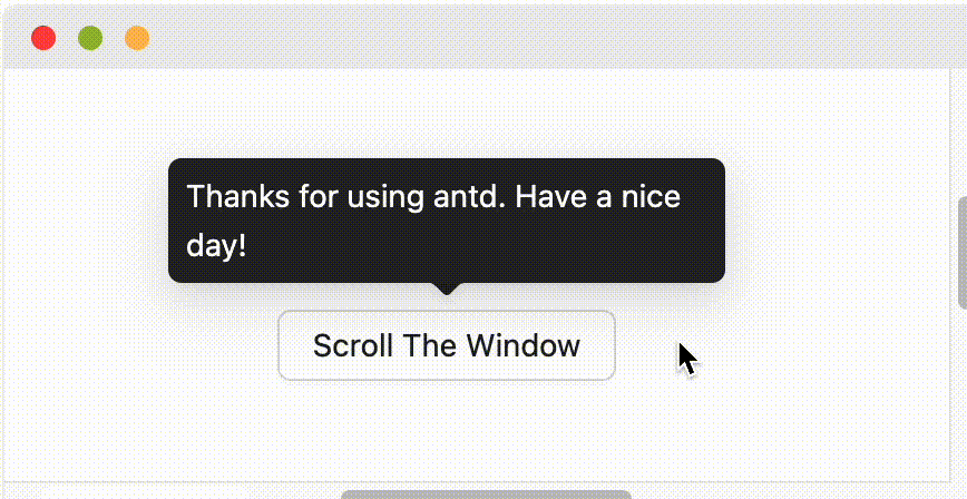
Simple text popup box.
Importimport{ Tooltip }from"antd"; |
Sourcecomponents/tooltip |
button/text/operation. It's often used instead of the html title attribute.Common props ref:Common props
| Property | Description | Type | Default |
|---|---|---|---|
| title | The text shown in the tooltip | ReactNode | () => ReactNode | - |
| Property | Description | Type | Default | Version |
|---|---|---|---|---|
| align | This value will be merged into placement's config, please refer to the settings dom-align | object | - | |
| arrow | Change arrow's visible state and change whether the arrow is pointed at the center of target. | boolean | { pointAtCenter: boolean } | true | 5.2.0 |
| autoAdjustOverflow | Whether to adjust popup placement automatically when popup is off screen | boolean | true | |
| color | The background color | string | - | 4.3.0 |
| defaultOpen | Whether the floating tooltip card is open by default | boolean | false | 4.23.0 |
| destroyTooltipOnHide | Whether destroy tooltip when hidden | boolean | false | |
| fresh | Tooltip will cache content when it is closed by default. Setting this property will always keep updating | boolean | false | 5.10.0 |
| getPopupContainer | The DOM container of the tip, the default behavior is to create a div element in body | (triggerNode: HTMLElement) => HTMLElement | () => document.body | |
| mouseEnterDelay | Delay in seconds, before tooltip is shown on mouse enter | number | 0.1 | |
| mouseLeaveDelay | Delay in seconds, before tooltip is hidden on mouse leave | number | 0.1 | |
| overlayClassName | Class name of the tooltip card | string | - | |
| overlayStyle | Style of the tooltip card | React.CSSProperties | - | |
| overlayInnerStyle | Style of the tooltip inner content | React.CSSProperties | - | |
| placement | The position of the tooltip relative to the target, which can be one of top left right bottom topLeft topRight bottomLeft bottomRight leftTop leftBottom rightTop rightBottom | string | top | |
| trigger | Tooltip trigger mode. Could be multiple by passing an array | hover | focus | click | contextMenu | Array<string> | hover | |
| open | Whether the floating tooltip card is open or not. Use visible under 4.23.0 (why?) | boolean | false | 4.23.0 |
| zIndex | Config z-index of Tooltip | number | - | |
| onOpenChange | Callback executed when visibility of the tooltip card is changed | (open: boolean) => void | - | 4.23.0 |
| Token Name | Description | Type | Default Value |
|---|---|---|---|
| zIndexPopup | z-index of tooltip | number | 1070 |
Please ensure that the child node of Tooltip accepts onMouseEnter, onMouseLeave, onPointerEnter, onPointerLeave, onFocus, onClick events.
It will follow placement config when screen has enough space. And flip when space is not enough (Such as top to bottom or topLeft to bottomLeft). Single direction such as top bottom left right will auto shift on the view:
When placement is set to edge align such as topLeft bottomRight, it will only do flip but not do shift.
Tooltip will cache content when it is closed to avoid flicker when content is updated:
// `title` will not blink when `user` is empty<Tooltip open={user} title={user?.name} />
If need update content when close, you can set fresh property (#44830):
<Tooltip open={user} title={user?.name} fresh />
Auto adjust Popup and arrow position when Tooltip is close to the edge of the screen. Will be out of screen when exceed limitation.
The simplest usage.
Support show, hide or keep arrow in the center.
We preset a series of colorful Tooltip styles for use in different situations.
There are 12 placement options available.
The Tooltip can be disabled by setting title={null} or title="".